Brand and Packaging Design for Vatt Cycle Wear
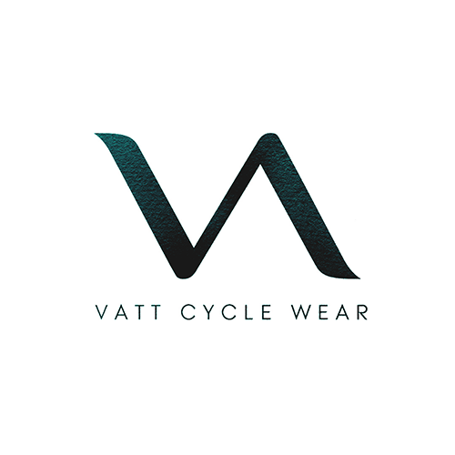
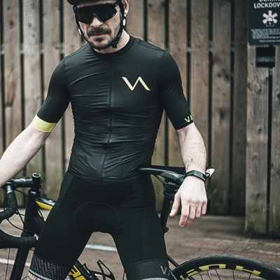
The Swedish and Finnish word 'vatt' translates to flow; either of water or electricity. Therefore, a lightning bolt was therefore the inspiration behind this cycle wear brand.
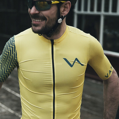
The VA section of the word is displayed, which is intended to resemble a bicycle frame. Overall, this abstract logo implies motion, appropriate for a sportswear brand.
Furthermore, the geometry and balance in the logo can be applied to a repeat pattern. At a small scale, this creates a woven fabric effect, inferring the craftsmanship of Vatt's products.
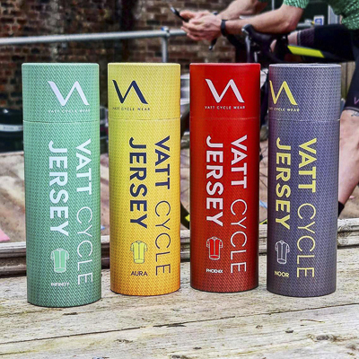
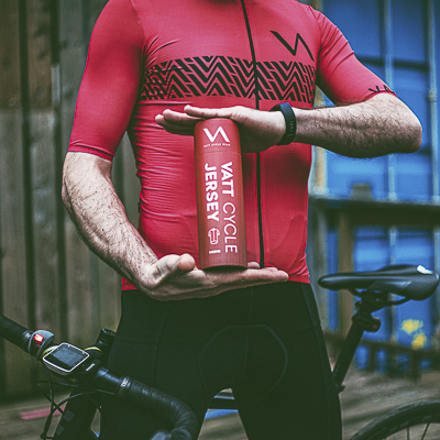
For each of the four jerseys in the range, individual packaging was designed. In addition, a cohesive aesthetic was created to allow these vibrant tubes to sit proudly at the point of sale and engage customers. This is in contrast to other other cycle gear which can be uniformly black.
Abell Design provided creative direction and design for Vatt. The services engaged were:
- Brand design
- Print design for packaging and labels
- Creation of the brand's digital aesthetic
- Briefing a photographer and videographer
"Abell Design understood what I was looking for and turned my idea into a reality. Everything was impeccable, proposal, logo, design, graphics, packaging etc. The concept Abell Design created was just amazing."
Alessandro Satta, MD, Vatt Cycle Wear